A documentation schema designed to make component intent legible to AI. Five layers — identity, intent, relationships, implementation, and governance — built as a diagnostic as much as a template.
I led documentation efforts at Epic Games for 5 years, across two distinct design systems. When I ran a test against the Epic Design System, 50+ components with consistent, mature documentation, the question was simple: how much of what AI needs could be extracted from the existing docs?
Around 80% extracted cleanly without any changes. The gaps that showed up were specific and fixable: missing token references, undocumented component relationships, and rules without reasoning. The docs didn't need to be rebuilt. The authoring template just hadn't been designed with an AI audience in mind.
This framing matters. It means the gap is in how the doc is structured, not how well it's written.
Every system will surface different gaps, and that's expected. But in my experience, the blind spot is almost always the same. Documentation was never designed to capture reasoning, and no standard authoring template includes a decisions field or a reasoning layer by default.
The way to find your gaps is to hold your existing docs against the schema I used to run that test. It's built around five layers: identity, intent, implementation, relationships, and governance, and it works as a diagnostic. Put it next to your existing template and ask: where does it map cleanly, and where does it fall short?
name: ""
description: ""
component_status: ""
doc_status: ""
use_when:
- ""
avoid_when:
- ""
prefer_instead:
- component: ""
reason: ""
best_practices:
do:
- rule: ""
reason: ""
dont:
- rule: ""
reason: ""
api:
props:
- name: ""
type: ""
default: ""
description: ""
events:
- name: ""
trigger: ""
returns: ""
variants:
- name: ""
description: ""
sizes:
- ""
states:
- ""
behavior:
- name: ""
rule: ""
decisions:
- reason: ""
composition:
contains:
- ""
used_in:
- ""
tokens:
- token: ""
controls: ""
governance:
owner: ""
last_reviewed: ""
Schema structure: The component doc schema, built around five layers: identity, intent, implementation, relationships, and governance
The places it falls short are your gaps. They'll be specific to your system, your team, and the decisions you've made about what belongs in a doc. That specificity means targeted additions to a template that's already doing most of the work, not starting over.
Once you've closed your gaps, your component doc becomes the one place where everything is true at once. Designers, developers, and AI all find what they need there, from the same artifact. It's not a replacement for Figma or code, those still hold their own source of truth. The doc is doing a different job: keeping the intent, the reasoning, and the decisions that every audience depends on in one place.
name: Menu
description: Surfaces hidden options during interaction.
component_status: stable
doc_status: complete

use_when:
  - To surface frequently used options
    that users specifically need
  - To navigate to different pages
  - To take an action in context

avoid_when:
  - Using as primary page navigation
  - Taking a primary action

prefer_instead:
  - component: Link
    reason: >
      Better for navigation —
      persists across views
  - component: Button
    reason: >
      Better for primary actions —
      visible by default

best_practices:
  do:
    - rule: >
        Use dividers to separate
        distinct groups of actions
      reason: >
        Reduces cognitive load when
        scanning a long list
  dont:
    - rule: >
        Use for primary page navigation
      reason: >
        Menu hides options — navigation
        should be persistent and visible

api:
  props:
    - name: label
      type: string
      default: ""
      description: >
        Accessible label for
        the menu trigger
    - name: disabled
      type: boolean
      default: false
      description: >
        Disables the menu trigger
  events:
    - name: onSelect
      trigger: When a menu item is selected
      returns: Item id

variants:
  - name: Default
    description: Standard menu without grouping
  - name: With dividers
    description: >
      Use when menu items fall
      into distinct groups

states:
  - default
  - open
  - closing
  - disabled

behavior:
  - name: Width
    rule: >
      The menu width matches the width
      of the longest item by default.
    decisions:
      - reason: >
          Prevents layout shift when
          menu content is populated
          dynamically.
  - name: Scrim
    rule: Opt-in, not applied by default.
    decisions:
      - reason: >
          Most menu contexts don't require
          focus blocking. A default scrim
          would over-interrupt the user.

composition:
  contains:
    - MenuItem
    - MenuItemSub

used_in:
  - FormSection
  - DataTable — row actions
  - PageHeader — overflow actions
  - ContextMenu

tokens:
  - token: color.surface.overlay
    controls: Background
  - token: color.border.subtle
    controls: Divider color
  - token: spacing.md
    controls: Item padding
  - token: radius.sm
    controls: Container border-radius
  - token: shadow.lg
    controls: Elevation

governance:
  owner: Design Systems Team
  last_reviewed
Menu example: The Menu component authored using the schema, showing how each layer fills out in practice, including the decisions field inside behavior
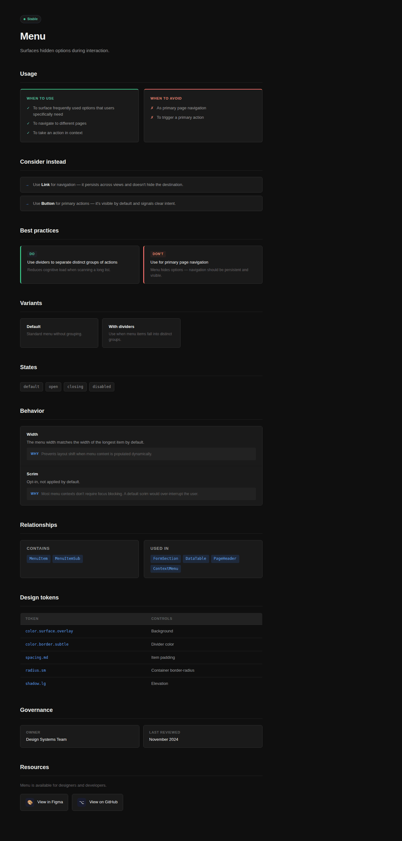
Reference page: The same schema rendered as a component reference page, showing how a single structured doc serves designers, developers, and AI from one artifact."


